We are excited to offer our customers a newly improved web experience. New features include...
- Mobile- & Tablet-Friendly Design
- Enhanced BackTpack Shopping Experience
- Streamlined Navigation
Plus, all the in-depth content we have always been proud to offer.
Mobile- & Tablet-Friendly Design
Utilizing responsive website technology the new BackTpack site design will conform to match the dimensions of any device screen width. The content of the site will also adjust for easy reading on a small screen. The menu will collapse for smart phone use making it easier than before to navigate through BackTpack.com.
Enhanced BackTpack Shopping Experience
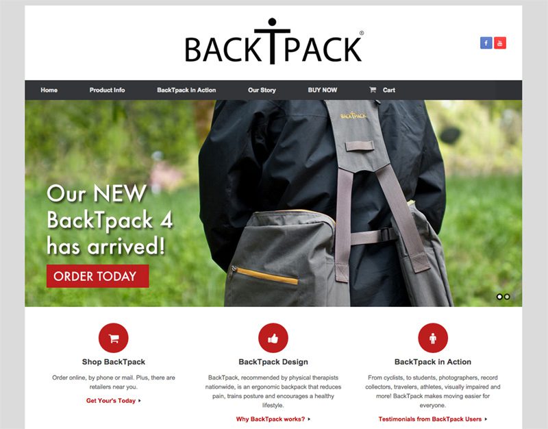
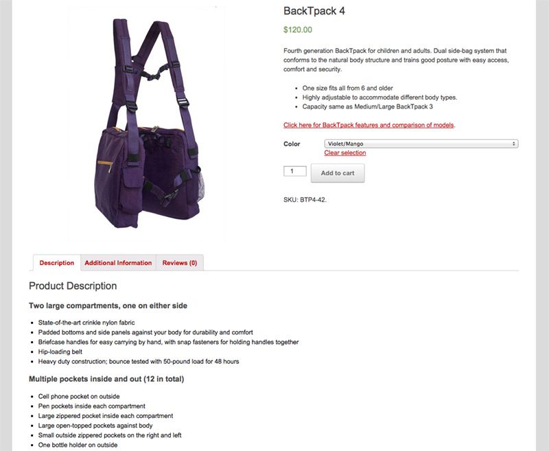
With a newly integrated Shopping Cart and Account System, BackTpack can now offer our valued customers an enhanced, but no less secure, shopping experience. Browse each BackTpack model with in-depth sizing and feature information, choose a color and size, then checkout or continue shopping for more products. Plus, customers can now review BackTpacks directly on the product page and share feedback for other customers. All the information you need about different BackTpack models at your fingertips.
Streamlined Navigation
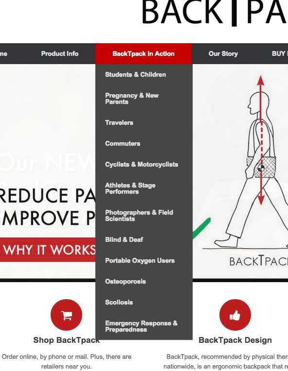
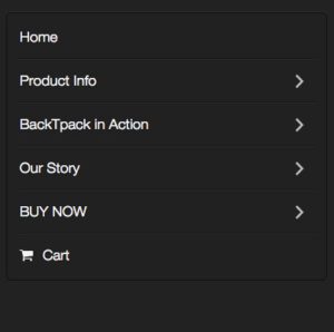
Overall the navigation and arrangement of the pages has been streamlined. All the same great information is available, but some might be found in a different location than the original site. For example, all the information about the many different types of users that enjoy BackTpack, like Commuters and Photographers, is now found under one dropdown menu labeled "BackTpack in Action". Check out our Site Map to find the information you seek, it catalogs all pages on the website.